OK.
As all of us full time, self employed creators always do I have been doubting if the way I publish and promote my new items is really the best, most efficient and (most of all) most fruitful strategy.
Having worked as an employed designer for several years BUT now recently a full-time Etsy seller (and much more serious about this business) I have come to several conclusions. I would like to discuss these with this team and hopefully in the end create something like a "work group" of people who are interested to try something new.
Due to the complexity of this topic I think I will start more then one thread, cause things might get quickly confusing.
So I would like to start off with the way we PUBLISH our products/listings here on Etsy.
>>> I started my shop off as a hobby, something to do whilst in between jobs. My shop developed "on the go", organic growth so to say. Whenever I came up with a new product I photographed and listed it. taking the "one item at a time" approach but learning about Etsy, description writing, pricing, and most of all photography at THE SAME time.
Now that I am in my third Etsy year, clear about the decision and the following consequences of wanting to do this full time, clear(er) about how I want my brand and it's image to look like and how to accomplish this look I am starting to think about PROFESSIONALISM. And with this comes efficiency and that only goes with being organized.
How do the "big players" organize their business? Well, the first thing that comes into my mind is that they all have their work time scheduled. And some strategic decision have to be made up front. Things need to done by a certain time and at the end of the deadline there is a BIG PRESENTATION.
All major labels, brands, magazines have catalogs. the entire new collection is being presented in ONE great revealing.
So this clashes with my "one item at a time" strategy. And to be honest, I have been so far reluctant to try anything else, cause it has been said so often that we want to spread our listing times. You spread the cost as well and each day some more views from new listings looks sounder than playing the "all at once" card...cause what if you chose the wrong day or time?! Or both?! Or if you are, like me in Europe but your main customer load is in the US and Australia.
Well, maybe there is never the perfect time. Something else will be always more preferable then what you are already doing.
As you might guess now, I am about to give it a try. I am preparing loads of nwe listings and saving them as drafts in order to reveal my new collection in one go. If that is all in one day, or maybe spread over two or three according to theme.... I don't know yet. I have still some uploading to do and this time to come to a decision.
But I would like what you people think. How do you proceed and have you already tried different styles?
i would really love some feedback and opinions.
As soon as I get some more free minutes (in the next few days) I will start another thread about publishing in combination with promotion (which is such a time consuming issue for all of us) and how I think Etsys treasury system is a bit "outdated", how it could be improved and how we could help each other to be less dependent from external taste makers aka. become the new taste makers ourselves.
>>>Pew, a lot of words in long sentences. Thank you for bearing with me and reading it all.
X from france,
Nic*

Showing posts with label apartment styling. Show all posts
Showing posts with label apartment styling. Show all posts
Saturday, March 8, 2014
Wednesday, February 12, 2014
Hunting art
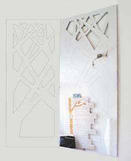
If you have ever been to my shop you will have seen listings like my Diamond felt coaster which is displayed on my great white, blank wall. Until recently I was very fond this wide emptiness cause it gives our busy household something clean, minimalist, uncluttered space. But now, I don't know if it is the nesting instinct of a pregnant lady... well, I WANT ART on my wall.
Something bright, abstract and BIG!
So I have been hunting the net, Pinterest and various blogs and I think I have narrowed it down to these ones (found on society6.com) :


Something bright, abstract and BIG!
So I have been hunting the net, Pinterest and various blogs and I think I have narrowed it down to these ones (found on society6.com) :
or something like this, found on interiormagasinet, but unfortunatly without artist reference :(
Or maybe a bit more fun? like these examples:
Marker line drawings with patches of color is what I loved to do myself - once upon a time...
...which gets me thinking... maybe I should create my own? Ahhhhh, the joys of indecisive pregnancy hormones.
Tuesday, August 27, 2013
New mirrors needs the home.
We all have mirrors in our home. We NEED mirrors. If we like it or not.
And since they do, literally, reflect us, why can't they also reflect our style?
Here my collection of mirrors..... customization always possible. Leave me a message!
The diamond - €32


And since they do, literally, reflect us, why can't they also reflect our style?
Here my collection of mirrors..... customization always possible. Leave me a message!
The diamond - €32


* the French country mansion - small €35 ; big €65


* the Paris city villa - big €70

* modern skyscraper Japan - €50


* New York City Manhattan island - €22.50

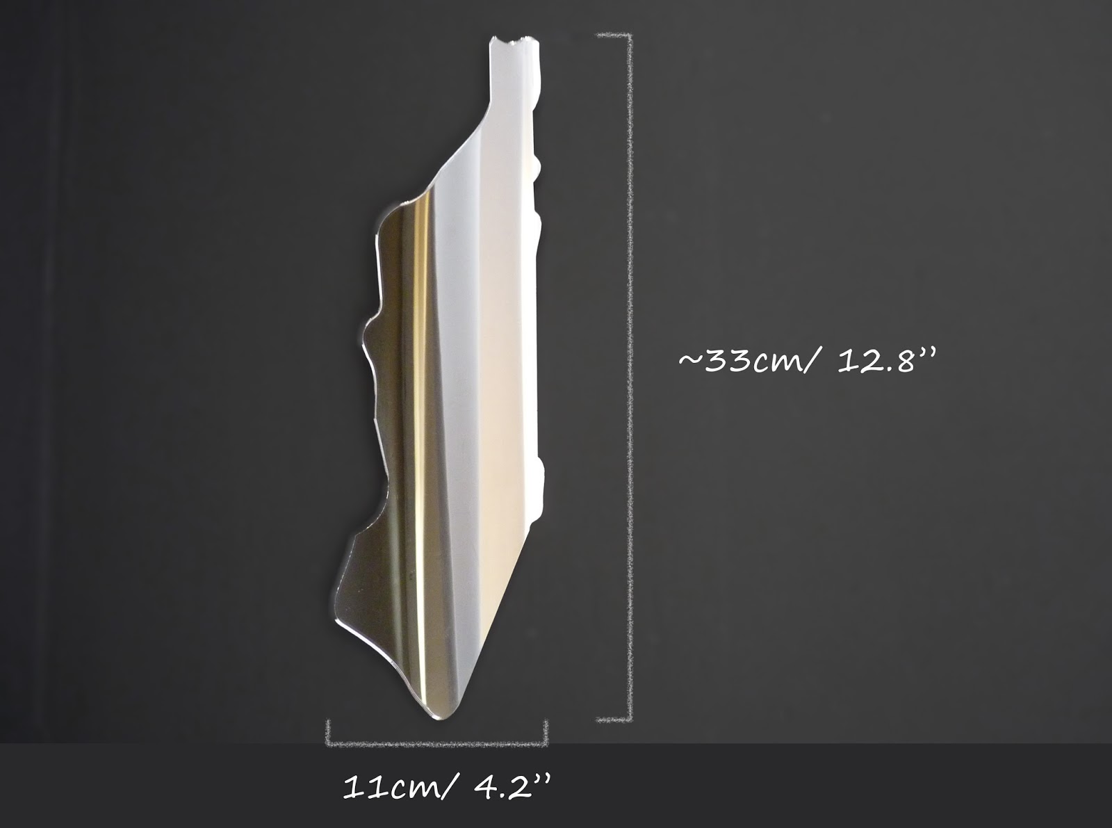
* San Francisco townhouse - € tba


Wednesday, July 31, 2013
Color cohesion for interiors and your online shop.
Having started my Etsy shop as an almost exclusive ceramic boutique, the question of color cohesion solved itself because my ceramics are all pure white with a hint of color here and there. Now that I am expanding my product range and experimenting with more materials and colors I look at my shop and have the feeling that color cohesion went out the window.
Also, with my search and work on new products I went a bit overboard with new materials and colors.... which blew my budget. But the nice thing about being an interior designer is to be able to design for other people, cause my home is very much styled through and through.
So it seems like I have two problems. But I think one is the solution to the other. Having a budget limit should help me get my cohesion problem solved. All it takes it a bit of discipline, right?! And disciplines best ally is organization.
Time to get things organized. And with hectic Christmas sale season right around the corner I could do with some organization. And to be most efficient and professional I will go about it interior designer style.
I often hear friends enthusiastically telling me what a great new 'thing' they found for their home, just to hear them a bit later moaning that their house looks messy, or not very 'trendy'. And oh what they would give to have one of those super styled through interiors you find so many of in magazines and Pinterest, etc.
Now, the thing stylists do differently is: they are organized. You look at your space and chose a color palette. The most common way is to create a mood board.


But basically anything can become your guideline: an outfit, a painting, a photograph.... anything!
I will choose as an example this picture of the coconuts. The shown example is the easiest way to attribute colors.


And looking at this interior with this sort of accessories, no one would actually think 'This reminds me of coconuts!', right?! but you could also go bold and chose the turquoise for the floor - see below!


Once you have your main color scheme set you can add little details in colors that enhance this (here summer/fresh/Caribbean) look.

And what goes well with coco nuts in a Bermuda blue lagoon? Right, pineapples and limes.


So far, so great. Now this is all fantastic for upgrading your interiors, but what does this have to do with your Etsy/Meylah/Dawanda shop, you might ask.
Well, if we take our shop as virtual interiors we can apply the same principals. And since products and colors change with the seasons you might re-think your way of going about the re-style of your shop.
Unless you are starting a brand new shop you will already have some "furniture", aka. other products and existing supplies in there and you might want to change gradually into new colors in order not to burst out of your budget limit.
So here is what we do in interior design (a bit of color re-cap I am sure you already know, but let's bring it back to memory):
Choose which items/colors/products you have most of or simply want to keep because they are your best-sellers, or have tons of stock or are simply favorite things.
I have a bright pink color that is called 'juicy watermelon' which is great for spring and summer, but less ideal for fall and winter. In order to use it for other seasons it can easily be manipulated by just adding some white, black, or black+white (grey) and it will look as followed:
If you just take a sheet of white paper and quickly do this with all your colors you'll get a nice chart of all the tints, tones and shades available to you and you quickly multiply your palette by three - talking about saving some money on new paints!
And if you don't work with paints but lets say fabrics or beads this is still helpful cause it shows you which colors of new supplies you need to buy in order to use the existing efficiently up.
Once I chose my new color combinations I want to work with (see picture of my pinboard below) I keep pieces of colored confetti in my wallet, so when I am out and about and see a paint, ribbon, beads etc. I think might fit my scheme I can verify if it fits.
And I also always keep the 'wrong colors' with me as well, because in different environments, changing light situations etc. you can easily grab the wrong tone and then, I at least, get annoyed I spend money I could have saved. Particularly tricky are colors like mint, that looks like aqua in yellow light, or you think you got a nice orange-y shade of peach just to notice at home its more salmon and your partner folds his hands upon his head cause which man likes 'salmon', or pink as they like to call it... lol.
>>>I hope you found this little article helpful. Feel free to leave comments, suggestions or your own tips.
Also, with my search and work on new products I went a bit overboard with new materials and colors.... which blew my budget. But the nice thing about being an interior designer is to be able to design for other people, cause my home is very much styled through and through.
So it seems like I have two problems. But I think one is the solution to the other. Having a budget limit should help me get my cohesion problem solved. All it takes it a bit of discipline, right?! And disciplines best ally is organization.
Time to get things organized. And with hectic Christmas sale season right around the corner I could do with some organization. And to be most efficient and professional I will go about it interior designer style.
I often hear friends enthusiastically telling me what a great new 'thing' they found for their home, just to hear them a bit later moaning that their house looks messy, or not very 'trendy'. And oh what they would give to have one of those super styled through interiors you find so many of in magazines and Pinterest, etc.
Now, the thing stylists do differently is: they are organized. You look at your space and chose a color palette. The most common way is to create a mood board.


But basically anything can become your guideline: an outfit, a painting, a photograph.... anything!
 |
| Luis Vuitton shop window |
 |
| random fashion outfit |
 |
| photograph of coconuts |
I will choose as an example this picture of the coconuts. The shown example is the easiest way to attribute colors.


And looking at this interior with this sort of accessories, no one would actually think 'This reminds me of coconuts!', right?! but you could also go bold and chose the turquoise for the floor - see below!


Once you have your main color scheme set you can add little details in colors that enhance this (here summer/fresh/Caribbean) look.

And what goes well with coco nuts in a Bermuda blue lagoon? Right, pineapples and limes.

**********************************
So far, so great. Now this is all fantastic for upgrading your interiors, but what does this have to do with your Etsy/Meylah/Dawanda shop, you might ask.
Well, if we take our shop as virtual interiors we can apply the same principals. And since products and colors change with the seasons you might re-think your way of going about the re-style of your shop.
Unless you are starting a brand new shop you will already have some "furniture", aka. other products and existing supplies in there and you might want to change gradually into new colors in order not to burst out of your budget limit.
So here is what we do in interior design (a bit of color re-cap I am sure you already know, but let's bring it back to memory):
Choose which items/colors/products you have most of or simply want to keep because they are your best-sellers, or have tons of stock or are simply favorite things.
I have a bright pink color that is called 'juicy watermelon' which is great for spring and summer, but less ideal for fall and winter. In order to use it for other seasons it can easily be manipulated by just adding some white, black, or black+white (grey) and it will look as followed:
 |
| LaNiqueHOME: how to find your new colors on low budget. |
If you just take a sheet of white paper and quickly do this with all your colors you'll get a nice chart of all the tints, tones and shades available to you and you quickly multiply your palette by three - talking about saving some money on new paints!
 |
| The top left is the 'juicy watermelon' that looks a lot pinker then the tomato red below. Yet the tints and tones look alike. Only the shades look really different. Good to know. The 'antique rose' to the right gives a beautiful off-white as tint and gorgeous warm greys as tone ans shade. I feel like I should repaint a room in one of those colors. |
 |
| Here a little sheet that I made quickly to see how my colors could look like. As you see the yellow is only nice as original color (big on the left) and as a lighter version tint (top small one). The Bermuda blue gives some nice variations as tint, shade and tone. |
And if you don't work with paints but lets say fabrics or beads this is still helpful cause it shows you which colors of new supplies you need to buy in order to use the existing efficiently up.
 |
| my current Summer color scheme will need re-working soon |
And I also always keep the 'wrong colors' with me as well, because in different environments, changing light situations etc. you can easily grab the wrong tone and then, I at least, get annoyed I spend money I could have saved. Particularly tricky are colors like mint, that looks like aqua in yellow light, or you think you got a nice orange-y shade of peach just to notice at home its more salmon and your partner folds his hands upon his head cause which man likes 'salmon', or pink as they like to call it... lol.
>>>I hope you found this little article helpful. Feel free to leave comments, suggestions or your own tips.
Greetings from France,
Nic*
As always: find the links to the shown pictures on my PINTEREST
Subscribe to:
Posts (Atom)